Spense

Payment Solution

Fintech

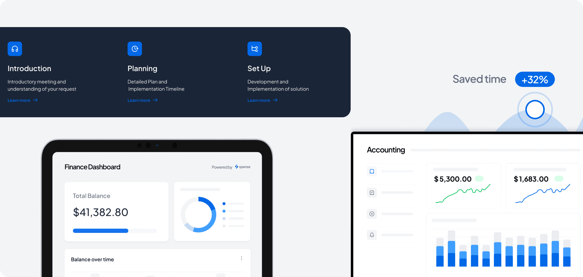
Spense is a payment solution for the automotive industry, serving car dealerships, workshops, and spare parts providers. It offers 

a comprehensive system for transactions 

and a dashboard for business financial transparency.

Initially, Spense had a basic landing page. 

As they gained clients, they sought Lavue's help to develop a full-fledged website.

Client:

spense.no

Expertise:

UX/UI Design

Graphic Design

Design System

Documentation

Timeline

7 weeks

Industry Overview and Analysis

Before diving into the website redesign, we conducted an extensive industry overview. This included analyzing how Spense was perceived online and the messages conveyed by its founders.

Before diving into the website redesign, we conducted an extensive industry overview. This included analyzing how Spense was perceived online and the messages conveyed by its founders.

We examined best practices across the payment and banking sectors, studying companies such as Mastercard, Visa, Adyen, Monite, and PayPal, as well as major banks like JPMorgan Chase & Co, Bank of America, and Wells Fargo. Our goal was to understand the competitive landscape and identify key elements that could influence Spense's branding and online strategy.

We examined best practices across the payment and banking sectors, studying companies such as Mastercard, Visa, Adyen, Monite, and PayPal, as well as major banks like JPMorgan Chase & Co, Bank of America, and Wells Fargo. Our goal was to understand the competitive landscape and identify key elements that could influence Spense's branding and online strategy.

Branding and Visual Identity

To create a strong and resonant brand image for Spense, we focused on several key elements

Branding Takeaways &
Statements

Branding Takeaways &
Statements

We distilled our industry analysis into key themes that Spense’s branding should reflect. These included technological advancements, efficiency, security, transparency, high-value transactions, and innovation.

We distilled our industry analysis into key themes that Spense’s branding should reflect. These included technological advancements, efficiency, security, transparency, high-value transactions, and innovation.

We developed a series of statements to guide Spense’s branding, emphasizing their role as a technological innovator in the banking and automotive sectors, the efficiency of their solutions, and their commitment to security and transparency.

We developed a series of statements to guide Spense’s branding, emphasizing their role as a technological innovator in the banking and automotive sectors, the efficiency of their solutions, and their commitment to security and transparency.

Visual Aesthetic and Color Palette

We explored two visual concepts for Spense’s branding with customers, and eventually decided on the first one - focusing on a formal, reliable, and strong visual identity. Our primary colors were ink blue, active blue, and light gray, with black and white for contrast.

We explored two visual concepts for Spense’s branding with customers, and eventually decided on the first one - focusing on a formal, reliable, and strong visual identity. Our primary colors were ink blue, active blue, and light gray, with black and white for contrast.

Wireframes and Design

We organized the wireframes to ensure a logical flow of information, with a strong focus on visual engagement through realistic and straightforward graphics.

Design

Design

The website’s design featured larger text, ample white space, and a minimalistic aesthetic. We established a high-contrast design to guide user attention from one key message to another, ensuring that CTAs were prominent and effective in enhancing conversions.

The website’s design featured larger text, ample white space, and a minimalistic aesthetic. We established a high-contrast design to guide user attention from one key message to another, ensuring that CTAs were prominent and effective in enhancing conversions.

Graphics and User Engagement

To secure high user engagement and message clarity, we developed numerous graphics that were realistic and easy to understand. The use of icons helped make information more visible and enhanced scroll depth.

To secure high user engagement and message clarity, we developed numerous graphics that were realistic and easy to understand. The use of icons helped make information more visible and enhanced scroll depth.

Impact and Results

By strategically aligning Spense’s visual and textual content with industry best practices and user engagement principles, we helped establish Spense as a trustworthy and innovative player in the automotive payment solutions sector.

Improved Online Presence

Improved Online Presence

Improved Online
Presence

Enhanced Spense's online representation

Enhanced Spense's online representation

Effective showcasing of services

Effective showcasing of services

Enhanced User Engagement

Enhanced User Engagement

Enhanced User
Engagement

Realistic graphics

Realistic graphics

Minimalistic Design

Minimalistic Design

Easy-to-understand offerings

Easy-to-understand offerings

Effective CTAs

Effective CTAs

High-contrast design

High-contrast design

Optimal CTA placement

Optimal CTA placement

Improved conversion rate

Improved conversion rate

And more than 20+ Screens

Email

Email

Lavue ©